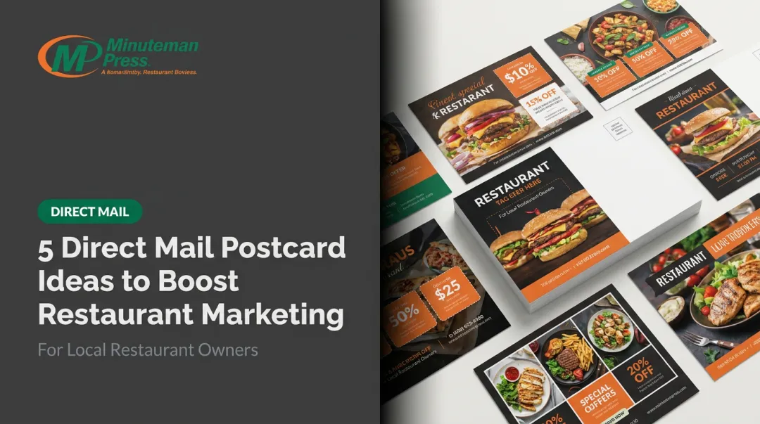
A postcard has roughly two seconds to earn attention before it lands in the trash. No amount of targeting fixes a card that fails to stop the reader. That's the gap this guide addresses.
Whether you're a Garland restaurant promoting a grand reopening, a Mesquite nonprofit building donor awareness, or a Dallas small business trying to reach new neighborhoods, the design principles here are practical, specific, and immediately usable.
Key Takeaways
- Bigger cards stand out — 6" x 9" is the sweet spot between impact and First Class postage rates
- One offer, one CTA — cramming in multiple messages kills response
- Both sides matter — postcards are delivered address-side up, so the back needs a hook too
- Images must be 300 dpi minimum — blurry print kills credibility before the message even registers
- Track everything — use QR codes, PURLs, or promo codes to make every campaign measurable
Choosing the Right Postcard Size
Postcard size affects more than aesthetics — it determines your postage rate, your print cost, and how much you can fit on the card. Understanding the USPS size tiers before you finalize your design saves money and prevents reprints.
USPS Size Rules You Need to Know
The USPS sets clear boundaries depending on mail class:
- Retail First Class postcards: Minimum 3.5" x 5", maximum 4.25" x 6"
- Commercial First Class postcards: Maximum 6" x 9" x 0.016" thick — the size tier most businesses target for campaigns needing more visual real estate
- USPS Marketing Mail (letter-size): Up to 6.125" x 11.5", which covers oversized mailers
- EDDM flats: Must exceed 10.5" long, 6.125" high, or 0.25" thick — these are flat-rate saturation pieces, not standard postcards
The mail class affects your postage rate, so confirm with your printer which tier applies to your chosen size before finalizing your design.
Matching Size to Campaign Goals
| Size | Best For | Trade-Off |
|---|---|---|
| 4" x 6" | Quick promos, appointment reminders, referral cards | Smaller footprint in the mailbox |
| 5" x 7" | Event invitations, seasonal promotions | Solid balance of space and cost |
| 6" x 9" | Campaigns needing room for detail or strong visuals | Max Commercial First Class size — sweet spot |
| 6" x 11" | Real estate, retail, food service | Oversized presence; Marketing Mail rates apply |
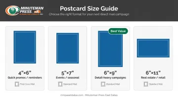
Minuteman Press East Dallas prints all of these standard sizes on 14pt C1S or C2S stock, with heavier options like 16pt available for campaigns where a premium feel matters.
EDDM: A Cost-Effective Option for Dallas Neighborhoods
For local businesses wanting to saturate specific zip codes or postal routes in Dallas, Garland, or Mesquite without a purchased mailing list, USPS Every Door Direct Mail (EDDM) is worth considering. EDDM pieces must qualify as flats — typically 6.25" x 9" or 6" x 11" — which also means they stand out in the mailbox.
Minuteman Press East Dallas handles EDDM campaigns end-to-end, from design and printing through USPS drop-off.
Design Principles That Make Postcards Stand Out
The Less-Is-More Rule
A postcard's job is to intrigue, not inform exhaustively. USPS design guidance recommends using no more than two or three colors and one or two fonts — and avoiding the urge to spell out every point on the mailpiece.
White space is not wasted real estate. It directs the reader's eye to what actually matters. A card crammed with text, competing images, and multiple offers communicates nothing clearly.
Headlines That Do the Heavy Lifting
The headline is the most important element on the front of your postcard. It needs to communicate the offer in a single glance.
Weak headline: We Offer Quality Home Cleaning Services in Dallas
Strong headline: $40 Off Your First Dallas Home Cleaning — This Month Only
The difference? Numbers, a specific offer, and urgency. Techniques that work:
- Lead with a dollar amount or percentage ("Save 20%," "$75 Off")
- Use time-bound language ("This Week Only," "Limited Spots")
- Address the reader's outcome directly ("Fill Your Tables This Weekend")
Color Psychology
Colors do more than match your brand palette — they influence how readers respond emotionally before they read a single word.
- Red: Urgency, action — works well for limited-time offers
- Blue: Trust, reliability — strong for financial, healthcare, or professional services
- Green: Wellness, nature, growth — natural fit for health and organic brands
- Yellow: Optimism, energy — effective for retail and food service
Color hierarchy also matters. Use your dominant color to draw the eye to the headline, and a contrasting accent color to make the CTA pop.
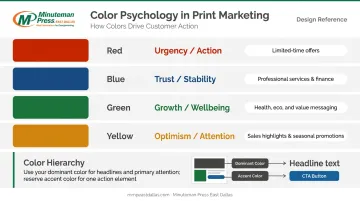
Image Selection
Once your color scheme is set, image quality becomes the next make-or-break factor. Images must be 300 dpi at final print size — per Adobe's print resolution guidance, the commercial benchmark for print-quality output. Scaling an image up more than 20% from its original size degrades quality noticeably in print.
Beyond resolution, choose images that:
- Reflect the actual audience (a family restaurant should show real diners, not empty tables)
- Tell a story in one frame (a real estate campaign works better with a couple at a front door than an aerial neighborhood shot)
- Avoid generic stock photography that feels lifted from any competitor's ad
Specialty Finishing as a Design Element
Physical texture and finish influence how a postcard is perceived before the reader absorbs the message. Minuteman Press East Dallas offers finishing options that make a postcard feel noticeably different from the surrounding mail stack.
Options worth considering:
- Die-cutting — a custom shape that stands out before a word is read
- Spot foil on the headline — draws the eye immediately and signals quality
- Soft-touch matte laminate — creates a tactile impression flat printing can't replicate
Writing Copy and CTAs That Convert
Front vs. Back Coordination
Postcards are delivered address-side up, which means the back is what most recipients see first. Many businesses treat the back as an afterthought. That's a missed opportunity.
Front: Bold headline, primary offer, dominant image. Keep copy to a minimum.
Back: Supporting subheadline that reinforces (not repeats) the front message, 2–3 benefit-focused bullet points, the CTA, and all contact details. Either side should be able to hook a reader who picks up the card cold.
What Makes a CTA Work
A call to action fails when it's generic ("Call us today") and buried in body text. Strong CTAs share three traits:
- Visually distinct — larger font, contrasting color, or a button-style element that breaks from surrounding text
- Action-specific — tells the reader exactly what to do and what they get
- Tied to a trackable mechanism — so you can measure whether it worked
Example CTAs by industry:
- Restaurant: "Scan to claim your free appetizer — valid through [date]"
- Home services: "Call 214-660-7003 before Friday for a free estimate"
- Nonprofit: "Visit [URL] to make your gift before the match deadline"
Brand Identity on Every Piece
Logo, phone number, website, and physical address should be present and easy to find. For Dallas-area businesses, putting the local phone number near the logo creates immediate accessibility — especially for service businesses where a call is the primary conversion action.
Before any postcard goes to print, verify:
- All offers, dates, and prices are current
- URLs and phone numbers are correct and tested
- QR codes scan to the right landing page
That checklist is worth the five minutes it takes. Minuteman Press East Dallas sends a graphic proof via email before production begins. For orders placed through the online designer, an online proof is presented at checkout — both steps exist to catch errors before ink hits paper.
Personalization and Print Enhancements That Boost Response
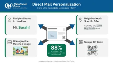
Variable Data Printing
Variable Data Printing (VDP) changes text, images, and offers from one printed piece to the next within the same print run. Instead of everyone in a zip code receiving the same card, each recipient gets a version that speaks directly to them.
According to USPS research, 88% of marketers say personalized direct mail significantly improves response rates, and Keypoint Intelligence found roughly two-thirds of recipients pay more attention to personalized mail than generic pieces.
What VDP can personalize on a single postcard run:
- Recipient name in the headline or greeting
- Location-specific offers (e.g., mentioning a specific Dallas neighborhood)
- Images tailored by demographic segment
- Unique QR codes for individual tracking
Minuteman Press East Dallas offers VDP for postcard campaigns — the same capability they use for dealership car promotions and targeted customer offers.
QR Codes and Trackable URLs
QR codes connect physical mail directly to digital action. Recipients can respond immediately from their phone, and every scan is trackable — making your postcard campaign measurable in ways traditional mail never was.
Place QR codes in a clean, uncluttered area — large enough to scan without zooming. Avoid placing them over busy backgrounds or within the USPS address/barcode zone.
Trackable options to build into every campaign:
- Unique QR code per audience segment
- Personalized URL (PURL) — e.g., yoursite.com/[FirstName]
- Dedicated phone number routed to campaign tracking
- Unique promo code tied to a specific offer
Segmentation as a Design Input
Targeting a specific Dallas neighborhood or zip code shapes more than your mailing list — it shapes the card itself. A postcard going to Lakewood should look different from one going to Forney.
Design elements worth adjusting by segment:
- Imagery that reflects the neighborhood or demographic
- Offer specifics relevant to that audience (pricing, services, promotions)
- Color palette and tone that resonates locally
Minuteman Press East Dallas can build targeted mailing lists by audience and geography, so the segmentation strategy and the design brief can be developed together.
Common Direct Mail Postcard Design Mistakes to Avoid
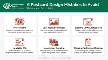
Most failed postcard campaigns share the same handful of errors:
- Overcrowding — too many images, offers, or copy blocks compete for attention and neutralize each other. If everything is emphasized, nothing is.
- Low-resolution images — anything below 300 dpi at final size prints blurry. Blurry postcards look cheap, and cheap postcards get tossed.
- No visible CTA — burying "call us" in the body text is not a call to action. If a reader has to search for what to do next, they won't.
- Blocking the USPS address area — USPS DMM 202 requires clear space for the address, postage, endorsement, and barcode zones on the mailing side. Dark backgrounds or heavy graphics in those areas can cause mail to be rejected or misprocessed.
- Inconsistent branding — fonts, colors, or imagery that don't match your established identity confuse recipients and erode trust. Inconsistency makes people question whether the piece is even from a real business.
- Skipping professional printing — even great design fails on thin paper with muddy color reproduction. The physical quality of a postcard signals the quality of your business — and a printer who knows USPS mailing compliance saves you from costly rejections.
Minuteman Press East Dallas has been helping DFW businesses navigate postal requirements and print specs since 2004, so you're not left guessing when it's time to mail.
Frequently Asked Questions
What is the best size postcard for direct mail?
The 6" x 9" format hits the sweet spot: the maximum size for Commercial First Class postcard rates and stands out noticeably in a mailbox. For tighter budgets, 4" x 6" works well for quick promotions, while 6" x 11" suits high-impact retail or real estate campaigns at Marketing Mail rates.
How many words should be on a direct mail postcard?
Keep front copy to a headline and one supporting line — the less, the better. The back can carry 2–3 benefit-focused bullets plus your CTA and contact details. Brevity and clarity consistently outperform longer copy on postcard formats.
What should go on the front vs. the back of a direct mail postcard?
The front carries your most compelling visual, primary headline, and core offer. The back holds the mailing address area, a supporting subheadline, key benefit bullets, and your CTA. Design both sides so either one can hook a reader who encounters the card cold.
What image resolution is needed for postcard printing?
Images should be at minimum 300 dpi at the size they'll be printed. Scaling an image up more than 20% from its original dimensions reduces quality and results in visible blurring on press.
Should I use gloss or matte finish for my direct mail postcard?
Gloss and UV coating enhance color vibrancy; matte offers a more premium, tactile feel. Either way, USPS requires the address, postmark, and barcode areas to stay legible — a one-sided coating (C1S) protects the print side while keeping the address side compliant.
How can I track responses from my direct mail postcard campaign?
Build in at least one trackable mechanism — a unique QR code, a personalized URL (PURL), a dedicated phone number, or a campaign-specific promo code. Each ties responses directly to your postcard so you get real data, not guesswork.